German Typefaces in World War II
In February 1933, the German Reichstag (parliament building) was set ablaze, an act of arson that enabled Adolph Hitler, who had been appointed Chancellor just the month before, to promulgate a series of dictatorial decrees suspending civil rights and freedom of expression. All aspects of German society, its social, political, economic, and cultural organizations—parliamentary democracy itself—were to be subordinated to a Nazi ideology of ein Volk, ein Reich, ein Führer. This policy of Gleichschaltung ("co-ordination" or "synchronization") extended, at its most mundane, even to the letterforms of words themselves.
More than four centuries earlier, in 1455, Johannes Gutenberg had printed his famous Latin Bible, using a blackletter form based on the distinctive thick and thin pen strokes of the medieval scribe. Imitating this German bookhand, the typeface came to be known as Textura, possibly from the woven appearance of the inked type. It was characterized by tall, narrow letters set close together—a condensed (and economic) layout that permitted the maximum number of characters on expensive paper.
In the late fifteenth and early sixteenth centuries, however, what little was printed in German used Schwabacher—or Bastarda, as it was considered a bastardized variation of Textura. A rounder, more cursive, almost italic letterform, it had been used to print the Nuremberg Chronicle in 1493 and was adopted by Martin Luther for his translation of the Bible, first published in 1534. The name even may have derived from his confession of faith, Die Schwabacher Artikel (1529), after a town near Nuremberg where the articles were adopted.
A century earlier, Italian humanists south of the Alps had developed a similar form of blackletter derived from an even earlier bookhand, Carolingian minuscule. Rotunda, as the name implies, was characterized by more rounded and open letterforms. The more ponderous blackletter forms of the north, given their imagined barbarity, were dismissed as Gothic. The humanists published in Antiqua, a style imagined to have been used by the ancient Romans themselves. Ironically, it was this typeface that two German printers, who had established a press in Italy, used in printing the first book in that country—Cicero's De oratore, in 1465. Known as Latin or Roman (as opposed to Gothic), the typeface spread throughout western Europe, except in Germany, where its introduction was resisted by the Lutheran Reformation.
In 1515, Emperor Maximilian I commissioned a typeface based on Schwabacher to be used for books in the imperial library. It was popularized by Albrecht Dürer's The Triumphal Arch, a monumental woodcut (measuring nearly 10 by 12 feet) commemorating Maximilian's rule as Holy Roman Emperor. Dürer's own theoretical works, such as Underweysung der Messung, "Treatise on Measurement," which sought to train German artists in precision drawing, also was printed in this new typeface. Because the angular lines and sharp finials of the letterforms often did not connect, especially in bowed letters such as b, d, o, p, and q, they were said to be "broken," and the seemingly fractured typeface came to be known as Fraktur (the last of the four basic blackletter stylistic families). By the middle of the sixteenth century, it had completely displaced Schwabacher.
Although Antiqua eventually came to dominate in most of Western Europe, Germany officially had used Fraktur since the unification of the country in 1871. Catholic texts, for example, tended to be printed in Antiqua, Protestant ones in Fraktur. With increased German nationalism, the two typefaces became increasingly politicized, so much so that only the heavy dark strokes of Fraktur were perceived to be truly representative of the German nation. Lighter and more open, Antiqua was dismissed as superficial and insignificant. It was not surprising therefore that Otto von Bismarck, who had served as Germany's first chancellor, rejected any books given to him that had been printed in Antiqua, declaring Deutsche Bücher in lateinischen Buchstaben lese ich nicht ("I don't read German books in Latin letters"), complaining that it took him much longer to do so. Fraktur came to be the standard typeface for all official German publications, as well as most books and newspapers.
At the beginning of the twentieth century, there was a reaction to what had come to be regarded as an antiquated and needlessly difficult style, with letterforms, especially decorative capitals (and in German, all nouns are capitalized), that showed little resemblance to their Roman counterparts. The lower-case "s" was easily confused for "f," for example (as they are in eighteenth-century English), and ligatures combined frequently-used letters such as "ch" and "st." Eventually, Fraktur came to be replaced by Antiqua, which was perceived as more modern and cosmopolitan. In 1911, it even was proposed that Antiqua be the country's official typeface, a proposal rejected in the Reichstag by only three votes.
With the rise of National Socialism, however, the typeface was banned as non-Aryan. Only Fraktur and other Gothic blackletter styles were deemed sufficiently Teutonic. The assumption of power by the Nazis the year before prompted a number of even bolder, more simplified variants of Fraktur. With maximum line width and minimally-decorated capitals, these nationalistic typeface were known collectively as Schaftstiefel Grotesk (from the high combat boots worn by the Wehrmacht) and characterized by a deliberately heavy, jagged, even brutish style. They included Tannenberg, Element, Deutschland, and National (introduced in 1933), Potsdam (1934), and Gotenburg (1935), all of which primarily were used for posters and propaganda.
(As a typographical term, Grotesk is used to describe, when compared to the elaborate convolutions of Fraktur, a san serif letterform that has more even, geometric stroke widths and lacks the elaborate serifs, the slight accents at the feet and tips of letters, of the older style. Because they were so different from their more ornate predecessors, they were considered grotesque.)
And yet, as early as 1934, Hitler, mindful of Germany's imagined future, expressed a distaste for Fraktur, denouncing its use in a speech at the Reichstag.
"Your alleged Gothic internalization does not fit well in this age of steel and iron, glass and concrete, of womanly beauty and manly strength, of head raised high and intention defiant....In a hundred years, our language will be the European language. The nations of the east, the north and the west will, to communicate with us, learn our language. The prerequisite for this: The script called Gothic is replaced by the script we have called Latin so far."
Finally, in an edict signed by Martin Bormann at the beginning of 1941, he decreed that
“It is false to regard the so-called Gothic typeface as a German typeface. In reality, the so-called Gothic typeface consists of Schwabacher-Jewish letters....Today the Führer...has decided that Antiqua type is to be regarded as the standard typeface [Normal-Schrift]. Over time, all printed matter should be converted to this standard typeface. This will occur as soon as possible in regard to school textbooks, only the standard script will be taught in village and primary schools. The use of Schwabacher-Jewish letters by authorities will in future cease. Certificates of appointment for officials, street signs and the like will in future only be produced in standard lettering."
A traditional letterform that had been quintessentially German for almost five hundred years suddenly was deemed completely un-German. The irony of such a sudden reversal in national identity is difficult to explain, except perhaps in a dictatorship. Hitler may have favored a style that evoked the antique and ancient, with its evocation of the Roman Empire. Certainly, the initial rationalization that Schwabacher had been Jewish in origin was untenable, although in emphasizing the word, it was not coincidental that the leading Jewish banker of the 1930s was named Schwabach. Or perhaps Judenlettern were too similar in appearance to Hebraic script. A less implausible explanation soon was given: that it simply would be easier for school children to learn a Roman script such as Antiqua. More likely, with the conquest of much of Western Europe, it was realized that decrees and proclamations in Fraktur largely were undecipherable outside Germany—and there was insufficient type to print them all in any event.
Weighted with such historical symbolism, Fraktur now survives for the most part only as a decorative style used in newspaper mastheads, beer advertisements, and some album art.
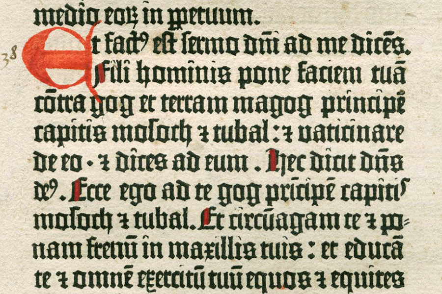
This detail is from a leaf of the
Gutenberg Bible in the Newberry Library (Chicago) and shows the intricacies of
Textura, which also was known as Textualis, B42 (from the number
of lines in each column) and, less precisely, D-K (Donatus-Kalender), after an earlier
typeface that had been used by Gutenberg in printing a Latin grammar by Aelius Donatus, as
well as
several calendars. It comprised more than 200 sorts (a piece of type representing a specific letter or
symbol) that imitated the bookhand of the scribe. Notice, too, the hand-painted rubric in imitation of a medieval manuscript.
More intriguing are the number of ligatures, letter variations, and abbreviations that made it
possible to justify the two columns of text.
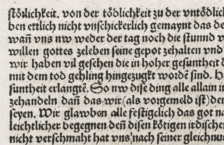
This leaf from the Nuremberg
Chronicle (1493) is in the Metropolitan Museum of Art (New York). When
compared to Textura, the rounded letterforms of Schwabacher,
especially in bowed letters such as d and o, are readily apparent.
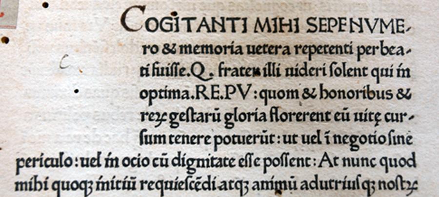
De oratore was the first extant
book to be printed in Italy, although it had been preceded by another edition of Donatus' Latin grammar
that has not survived. Printed at the Benedictine monastery of St. Scholastica (Subiaco)
in Lazio near Rome, where there was a large number of German monks, the
beginning of the book has been left blank so that a decorated initial could be
added later. Here, the bowed letters of Antiqua are more open and
rounded still. (This copy is in the University of Barcelona.)
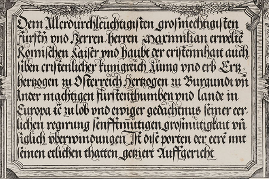
This text block is just below the cupola of Dürer's The Triumphal Arch and shows the sharp angles of Fraktur to good effect, although they are less pronounced than Textura. The enormous woodblock is in the Metropolitan Museum of Art (New York).
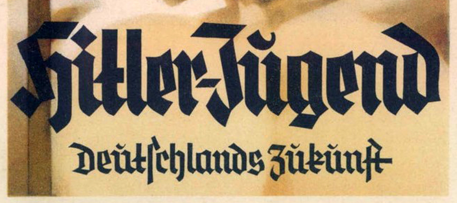
This detail is from a propaganda postcard circa 1933 for "Hitler Youth, Germany's Future." It was illustrated by Ludwig Hohlwein, a master of Palkatstil ("poster style") that emphasized bold lettering and flat colors. One of the most successful commercial artists of the early twentieth century, he also was an ardent nationalist who joined the Nazi party the year it came to power.
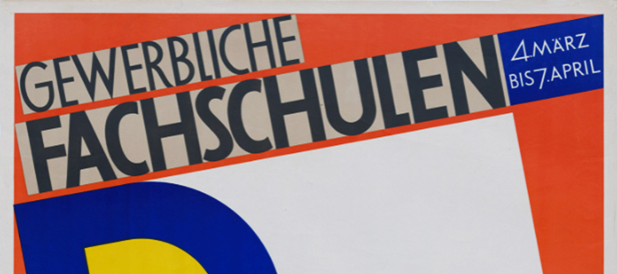
And this detail is from a poster by Paul Renner in the Museum of Modern Art (New York). It advertises an exhibition of the Technical Schools of Applied Arts of Bavaria in 1928, a year after he had introduced Futura, which he described as die Schrift unserer Zeit, "the typeface of our time." A geometric sans serif based on the aesthetic of the Bauhaus art school (and the British Arts and Crafts movement), Futura is considered one of the most influential of all modern letterforms. In 1933, when the National Socialists came to power, Renner was arrested and dismissed from his post as director of the Meisterschule für Deutschlands Buchdrucker ("Master School for Germany's Printers"). A few months later, the Bauhaus, too, was forced to close. Its last director was Ludwig Mies van der Rohe, who famously had adopted the principle that "less is more."
Having inveighed against the Nazi's campaign demonizing modern art and architecture (which were denounced as "cultural Bolshevism"), its supposed Jewish and Communist adherents, and the country's antiquated black letter typefaces and stubborn capitalization of nouns, Renner was not allowed to work at a regular job. Instead, he turned to graphic and font design and in 1939 published Die Kunst der Typographie ("The Art of Typography"), which was set in Futura, and Renner Antiqua, a serif typeface. Two years later, tacitly accepting the very argument that Renner himself had made against Fraktur, the letterform officially was abandoned and Antiqua adopted in its place.
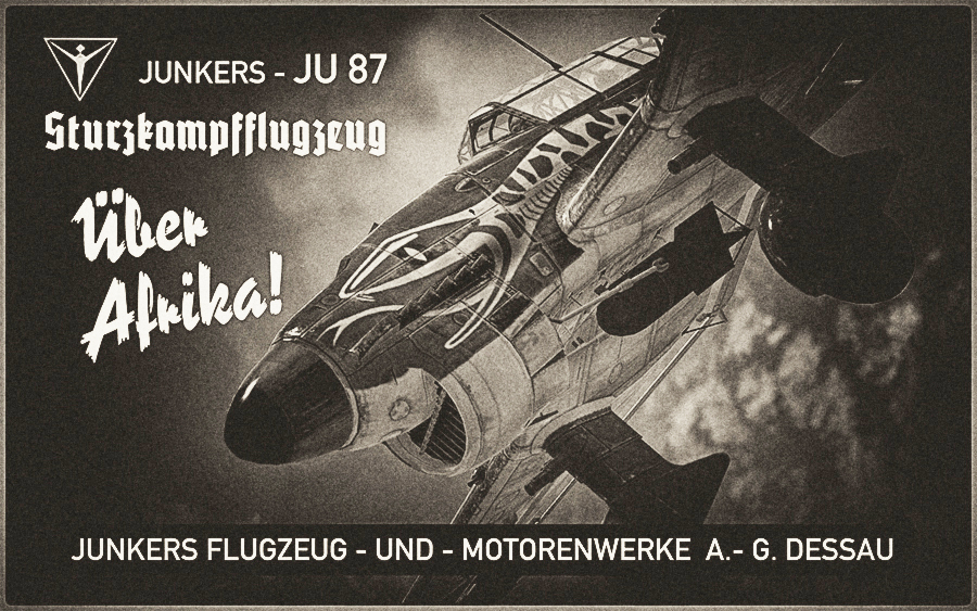
Sturzkampfflugzeug (dive bomber) in the imagined poster above is in Potsdam and depicts T6+DP as it appeared over Libya in the summer of 1941, just as the shift to non-Gothic typefaces was being implemented. Its use in the advertisement, therefore, likely would have been an anachronism. Reporter was a brushstroke font introduced in 1938, as was Reporter No.2—a simplified version with fewer breakthroughs within the strokes than the original, and which has been used here. The boxed text running along the bottom is DIN 1451, which was established by the Deutsches Institut für Normung ("German Institute for Standardization") in 1936 to standardize industrial lettering. Given its legibility, it was the official German typeface for highway and street signs, and administrative and technical documents. The proportions of the characters, with their uniform stroke width and geometric appearance, were designed to conform to a grid and so could be easily spaced when written. Aesthetically pleasing, it soon was applied to advertising as well.
This page has been constructed in Verdana, an eminently safe and predictable font created by Matthew Carter and made especially popular with its adoption by Microsoft and Google—and IKEA, which caused a scandal when it changed its corporate typeface from Futura to Verdana in 2009.