German Typefaces in World War II
In February 1933, the German Reichstag (parliament building) was set ablaze, an act of arson that enabled Adolph Hitler, who had been appointed Chancellor just weeks earlier, to promulgate a series of dictatorial decrees suspending civil rights and freedom of expression. All aspects of German society—social, political, economic, cultural, parliamentary democracy itself—were to be subordinated to a Nazi ideology of ein Volk, ein Reich, ein Führer. This Gleichschaltung or coordination of people and institutions by means of official policy extended, at its most mundane, even to the letterforms of words themselves.
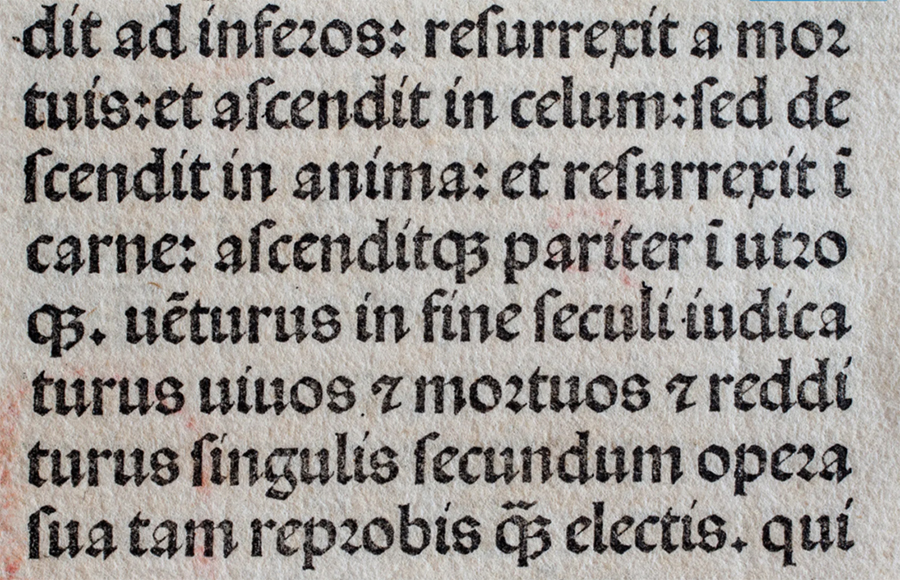
More than four centuries earlier, in 1455, Johannes Gutenberg had printed his famous Latin Bible, using a blackletter form based on the distinctive thick and thin pen strokes of the medieval scribe. Imitating this book hand, the typeface was known as Textura (from the woven look of the inked type and textured pattern of the page) or Textura Quadrata (from the angular, squared appearance of the letters themselves). It was characterized by short vertical strokes, evenly and tightly spaced, and finished with diamond-shaped serifs.
South of the Alps, Italian humanists had developed a similar form of blackletter derived from an even earlier book hand, Carolingian minuscule. Rotunda, as the name implies, was characterized by wider, more rounded and open letterforms. Instead of serifs at the foot of the stroke, it flicked up in a style similar to cursive script. The more ponderous blackletter of the north, given its imagined barbarity, was dismissed as Gothic—a letterform that, in fact, shared many characteristics with Gothic architecture and its emphasis on vertical proportions and ornate decoration.
Influenced by the humanists, another rounder and more cursive letterform evolved early in the sixteenth century: Schwabacher (or Bastarda, because it was considered a bastardized variation of Textura). Most printing in Germany was in Schwabacher—for example, the Nuremberg Chronicle in 1493. It was adopted, too, by Martin Luther for his translation of the Bible, which was published in 1534. The name even may have derived from his confession of faith, Die Schwabacher Artikel (1529), after a town near Nuremberg where the articles were adopted.
In 1515, Emperor Maximilian I commissioned a typeface based on Schwabacher to be used for books in the imperial library. It was popularized by Albrecht Dürer's The Triumphal Arch, a monumental woodcut (measuring nearly 10 by 12 feet) commemorating Maximilian's rule as Holy Roman Emperor. Dürer's own theoretical works, such as Underweysung der Messung ("Treatise on Measurement"), which sought to train German artists in precision drawing, also was printed in this new typeface. Because the angular lines and sharp serifs of the letterforms often did not connect, especially in bowed letters such as b, d, o, p, and q, they were said to be "broken," and the seemingly fractured typeface came to be known as Fraktur—the last of the four basic blackletter stylistic families. By the middle of the sixteenth century, it had completely displaced Schwabacher.
The humanists themselves published in Antiqua, a style imagined to have been used by the ancient Romans. Ironically, it was this typeface that two German printers, who had established a press in Italy, used in printing the first book in that country, Cicero's De oratore in 1465. Known as Latin or Roman (as opposed to Gothic), the typeface spread throughout western Europe in the mid-fifteenth and sixteenth centuries—except in Germany, where its introduction was resisted by the Lutheran Reformation.
Although Antiqua eventually came to dominate, Germany had used Fraktur since the unification of the country in 1871. Catholic or Latin texts, for example, tended to be printed in Antiqua, Protestant ones in Fraktur. With increased German nationalism, the two typefaces became increasingly politicized, so much so that only the heavy dark strokes of Fraktur were perceived to be truly representative of the German nation. Lighter and more open, Antiqua was dismissed as superficial and insignificant. It was not surprising, therefore, that Otto von Bismarck, who had served as Germany's first chancellor, rejected any books given to him that had been printed in Antiqua, purportedly declaring Deutsche Bücher in lateinischen Buchstaben lese ich nicht ("I don't read German books in Latin letters") and complaining that it took him much longer to do so. Fraktur came to be the standard typeface for all German publications, as well as most books, magazines, and newspapers.
By the beginning of the twentieth century there was a reaction to Fraktur—which had come to be regarded as an antiquated and needlessly difficult style, with letterforms, especially decorative capitals (and in German, all nouns are capitalized), that showed little resemblance to their Roman counterparts. Ligatures such as "ch" and "st" were unfamiliar, as was the long-s, which was easily confused with "f" (as it is in eighteenth-century English), and the eszett or double "ss" (ß). Eventually, Fraktur came to be replaced by Antiqua, which was perceived as more modern and cosmopolitan. In 1911, it even was proposed that Antiqua be the country's official typeface, a proposal rejected in the Reichstag by just a few votes.
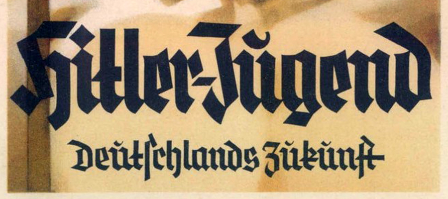
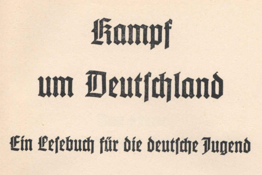
With the rise of National Socialism, however, the typeface was banned as non-Aryan. Only Fraktur and other Gothic blackletter styles were considered sufficiently Teutonic; indeed, they were deemed an innate part of the German character. The assumption of power by the Nazis prompted a number of even bolder, more simplified variants of Fraktur. With maximum line width and minimally-decorated capitals, these nationalistic typefaces were known collectively as Schaftstiefel Grotesk (from the high combat boots worn by the Wehrmacht). Characterized by a deliberately heavy, jagged, even brutish style, they included Tannenberg (Deutschland), Element, and National (introduced in 1933), Potsdam (1934), and Gotenburg (1935), all of which primarily were used for posters and propaganda.
(As a typographical term, Grotesk is used to describe, when compared to the elaborate convolutions of Fraktur, a san serif letterform that has more even, geometric widths without the serifs that accented the end of the stroke. So different from their more ornate predecessors, such styles were considered grotesque.)
And yet, as early as 1934, Hitler, mindful of Germany's imagined future, expressed a distaste for Fraktur, denouncing its use in a speech at the Reichstag.
"Your alleged Gothic internalization does not fit well in this age of steel and iron, glass and concrete, of womanly beauty and manly strength, of head raised high and intention defiant....In a hundred years, our language will be the European language. The nations of the east, the north and the west will, to communicate with us, learn our language. The prerequisite for this: The script called Gothic is replaced by the script we have called Latin so far."
Finally, in an edict signed by Martin Bormann at the beginning of 1941, Hitler decreed that
"It is false to regard the so-called Gothic typeface as a German typeface. In reality, the so-called Gothic typeface consists of Schwabacher-Jewish letters....Today the Führer...has decided that Antiqua type is to be regarded as the standard typeface [Normal-Schrift]. Over time, all printed matter should be converted to this standard typeface. This will occur as soon as possible in regard to school textbooks, only the standard script will be taught in village and primary schools. The use of Schwabacher-Jewish letters by authorities will in future cease. Certificates of appointment for officials, street signs and the like will in future only be produced in standard lettering."
A traditional letterform that had been quintessentially German for almost five hundred years suddenly was deemed completely un-German and officially abandoned. Except in a dictatorship, the irony of such a sudden reversal in national identity is difficult to explain. Hitler may have favored a style that evoked the antique and ancient, with its evocation of the Roman Empire. Certainly, the initial rationalization that Schwabacher had been Jewish in origin was untenable, although in emphasizing the word, it may not be coincidental that the leading Jewish bankers of the 1930s were named Schwabach. Or Judenlettern may have been too similar in appearance to Hebraic script.
A less implausible explanation soon was given: it simply was easier for schoolchildren to learn a Roman script such as Antiqua. Likely too, with the conquest of much of Western Europe at the beginning of World War II, it was realized that decrees and proclamations in Fraktur largely were unintelligible outside Germany—and there were insufficient presses and stocks of type to print them all in any event.
Weighted with such historical symbolism, Fraktur now survives for the most part only as a decorative style used in commercial logos such newspaper mastheads and beer advertisements, some album art—and exercises in calligraphy.
This detail is from a leaf of the Gutenberg Bible in the Newberry Library (Chicago) and shows the intricacies of Textura, which also was known as Textualis, B42 (from the number of lines in each column) and, less precisely, D-K (Donatus-Kalender), after an earlier typeface that had been used by Gutenberg in printing a Latin grammar (and several calendars) by Aelius Donatus.
The intention was to imitate in type the book hand of the medieval scribe, duplicating the various contractions and abbreviations that allowed the maximum number of characters to be printed on the page. If on parchment, a book such as the Gutenberg Bible (which is approximately 1,280 pages), would have required the treated skins of perhaps 170 animals. Notice the hand-painted rubric in imitation of a manuscript—and the short ascender in the letter "d" and equally short descenders in "p" and "q." Such early books (printed before 1501), of which the Gutenberg Bible is the prime example, are called incunabula, from the Latin for "cradle" or "swaddling clothes," signifying the infancy of printing's development.
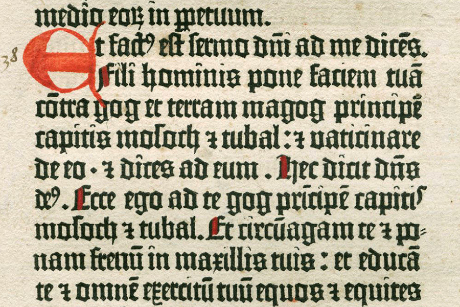
The lines above are from the Latin Vulgate (Ezekiel 38:1–4) and display some of the 290 typographical sorts (a piece of type representing a specific letter or symbol) that were used in printing the Gutenberg Bible, including ligatures and letter variations, abbreviations and contractions.
Unless one is a paleographer, a blackletter style such as Textura can be difficult to decipher, even in print—and, when written by the scribe, laborious to construct: six separate strokes were required to form the letter "n." The short vertical stroke is a minim, which was finished with a diagonal serif at the top and bottom or a slightly longer line to join them. In letters constructed only of minims, such as i (j), u (v, w), n, and m, this repetition of strokes set uniformly together offers scant distinction between them—and the words they form, such minimum (from which "minim" is derived). Often, the meaning of such words can be determined only from their context, a task made no easier by the use of brevigraphs, in which two or more letters are abbreviated by a symbol or special character.
For example, the symbol that looks like a "7" with a strikethrough in the middle (as the number is written in Europe) abbreviates et ("and"). Notice, though, that the word and its symbol both are used—arbitrarily, it seems (unless it is to justify the line). The symbol resembling a "9" written above the line at the end of a word usually abbreviates "us"—and so, fact9 for factus and De9 for Deus. A horizontal mark over a vowel indicates that the following "m" or "n" (or both) has been omitted, especially a final "m," of which there are several examples (dicē[n]s, cō[n]tra, prī[n]cipē[m], educā[m], tuū[m]). This abbreviation of a word by omitting letters at the end is termed a suspension, or what Cappelli called a truncation.
Dominus is another of the nomina sacra which, because names for the divine were used so often in medieval texts, invariably are abbreviated. In the first line of Gutenberg's text, the middle letter of what seems to be "dīīi" actually is "n" (this being a problem with minims). The mark above it signifies that "omi" has been omitted: d[omi]ni. This is the genitive case of the noun (domini) and so ends in "i." In the fifth line, the word is in the nominative (dominus) and the abbreviation ends in "s": d[omi]n[u]s. Such an omission of letters from the middle of an abbreviated word is termed a contraction—although it never was used if the meaning of a word was rendered ambiguous as a result.
All this is easier to appreciate if the text is in Roman type and not abbreviated.
Et fact[us] est semo D[omi]ni ad me, dicē[n]s: Fili hominis pone faciem tuā[m] cō[n]tra Gog, et terram Magog, principē[m] capitis Mosoch, et Thubal: et vaticinare de eo, et dices ad eum: Haec dicit D[omi]n[u]s De[us]: Ecce ego ad te Gog prī[n]cipē[m] capiti[s] Mosoch et Thubal, et circū[m]agam te, et ponam frenū[m] in maxillis tuis: et educā[m] te, et omnē[m] exercitū[m] tuū[m], equos et equites...
"And the word of the Lord came unto me, saying Son of man, set thy face against Gog, the land of Magog, the chief prince of Meshech and Tubal, and prophesy against him, and say, Thus saith the Lord of God; behold, I am against thee, O Gog, the chief prince of Meschech and Tubal; and I will bring thee back, and put hooks into thy jaws, and I will bring thee forth, and all thine army, horses and horsemen..."